Back-to-school dashboard for Mexico
In May 2020, as the COVID-19 pandemic was spreading worldwide and becoming increasingly complex to handle, UNICEF Mexico launched the first activation of the 3-year Long Term Agreement (also referred to as “LTA” below) signed with UNICEF HQ, CartONG and MapAction in the second half of 2019.
This first activation occurred after UNICEF was approached by the Mexican Secretaría de Educación Pública or Ministry of Education in English (also referred to as “MoE” below) to support the creation of a dashboard aiming to display and monitor real-time information on key education indicators on elementary schools at the national level in order to map COVID-19 affectations before the start of the new school year. As such, the dashboard was meant to play a key role in helping Mexico manage the return to school for millions of pupils in the context of the health crisis.
At the start of the project, it was decided that the form and database used to collect the data would be handled by the Mexican Ministry of Education at the federal level – with the option of gathering information directly from schools. This was an unprecedented effort from the MoE, since for the first time it would be possible to have real-time information and identify the need of schools without triangulating information through each one of the local ministries of education. For the rest, while the MoE (under Ministry of Basic Education) and UNICEF were responsible for technical discussions of key indicators, the development of the dashboard was the prerogative of both CartONG and MapAction.
Did you know?
The joint LTA with UNICEF was made possible by the signing of a 3-year Memorandum of Understanding between CartONG and MapAction in the first part of 2020.
A comprehensive Analytic Dashboard for Back to School Follow-up
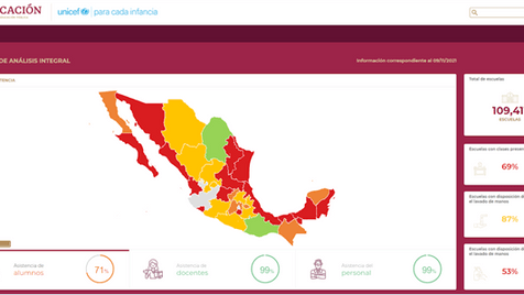
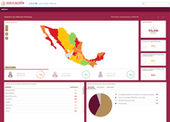
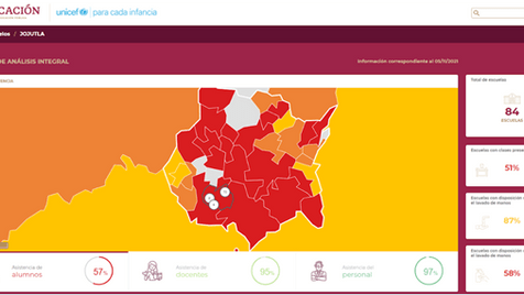
The dashboard was designed to display on both a map and a series of graphs, several key COVID-19 related indicators on schools – determined by the MoE and UNICEF Mexico – at school, municipality, administrative division and country levels. In addition, the MoE wanted to enable a daily update of the dashboard by having the data regularly collected by the director (or delegate) of each school.
While the dashboard had originally been envisioned as a monitoring and decision-making tool for head teachers and officials only, the MoE and UNICEF also requested in the early stages of the development process that it be designed for public usage to also be accessible to families, associations and the media, requiring changes to the initial infrastructure.
Starting from June 2020, CartONG and MapAction thus worked on the data management and visualization process which combined the following two components:
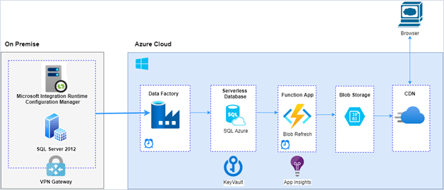
- The back-end structure of the dashboard: running on Microsoft’s Azure Cloud, it pulls the data daily from the central database managed by the MoE. Set of files filled with data are then stored on Azure’s Blob Storage. The Azure system includes a daily aggregation calculation in order to read the source data available at school level, and obtain figures at municipality, administrative division and country levels.
- The front-end application: developed with Vue.js framework and hosted in Azure, the front-end app reads the files. Data is then classified in different categories such as general information on the schools (registered students, number of staff, enrollment on different programs), actions done against COVID, absence rates of students, sanitary conditions (water supply, availability of soap, towels and hydro-alcoho lic gel, or existence of drainage system, between others), etc. and creates the on-demand views requested by the user.
The various data visualizations showing on the dashboard were implemented based on the importance given to each indicator by the MoE:
- The group of key indicators – including the percentage of on-site lessons, the attendance rate of students, teachers and other staff in cases where the school is open, the reasons for absenteeism, and the percentage of schools with water or soap available for hand washing – all have their own visualization feature adapted to the nature of the data (percentages, pie chart, bar chart, etc.).
- Other types of indicators – for instance basic services available in schools, elementary sanitary conditions in schools or reasons why schools do not offer on-site classes – are displayed in a table style below the main map and graphs.
A first collaboration for CartONG and MapAction as part of the LTA
For this first collaboration under the new LTA, each organization took a lead on different aspects.
MapAction was tasked with the development, setup and support on all the Azure Cloud infrastructure (aka. the back-end part of the development of the dashboard) building upon the expertise of the volunteer the organization had identified for the project. Consequently, MapAction also dealt with all technical communications with the MoE’s database engineers, and was in charge of running a series of key tests (Quality Assurance, User Acceptance test, automated system tests, etc.), with the support of CartONG’s team.
In turn, CartONG took on the development of the front-end of the dashboard. As the tool was designed for different types of audiences, it was important to make it easy to use and understand for all types of users. The expertise in user-experience design of one of our web developers was therefore central to the development of the front-end of the application. CartONG also managed the project for our two organizations while also leading most of the coordination with UNICEF, which included requirement definition, presentations and feedback management.
As the situation worsened in Mexico and the schools remained closed for the rest of the academic year, the public launch of the dashboard planned at the end of August 2020 was postponed to 2021 – which gave more time to CartONG and MapAction to prepare the tool for the 2021-2022 school year. In particular, CartONG worked on user documentation while technical documentation and updates to the dashboard were jointly done by our two organizations.
Designing a dashboard with good user experience in mind!
One of the main challenges linked to the development of this tool was to make it easily accessible by all types of users, even more so after the MoE had asked for the dashboard to be designed for public usage. Inevitably, this led to an increased focus on user experience and the development of user-friendly features.
For this reason, the navigation can be carried out either via the map by zooming in and out or by using the drop-down menus. In addition to the dashboard responsiveness on all types of devices, particular attention has been given to the colors, the icons used to represent the different graphs as well as the different types of graphs allowing to read the data more easily.
Indeed, a color code was set up to relate to the Ministry of Health coding used nationally to map health situations related to the COVID-19 pandemic. As the user navigates through the dashboard, zooms in and out of the map, the data breaks down from country, administrative divisions, municipality to school levels, and the colors of the map and graphs also adapt to each level and situation. This allows the user to use the color code as a breadcrumb trail to easily navigate from one level to another.
In order to make the dashboard widely usable, the map and charts can also be downloaded in PDF formats for offline reading and use. Moreover, the user can download the raw data of the dashboard – whether disaggregated or not – as a CSV file.
A few lessons learned
As the situation has been very unstable in Mexico, like in many countries worldwide, and still remains challenging especially for schools, CartONG and MapAction have had to continuously adapt. Such a level of uncertainty has not only resulted in a change of timeline for the project, but also in multiple updates in the requirements list as new information on the school situation arose. These changes sometimes affected the data model with a direct impact on the back-end configuration of the dashboard or some of the front-end design aspects (e.g. placement of indicators, labelling, etc.). This first activation thus reaffirmed the need for CartONG to strive towards strengthening as much as possible the requirement definition step, trying to better anticipate unstable situations that can provoke drastic changes in needs to better guide the partner organization and lead the project.
On a more technical level, developing such a large-scale dashboard required adaptation and reactivity from both CartONG and MapAction’s teams. After receiving the MoE’s request for a public tool, we had to re-assess the number of target users, which was estimated by MapAction to be slightly above 25,000 simultaneous users. We then had to ensure the infrastructure would support that amount of users, as it requires more complex systems. Luckily the stress tests conducted in loader.io were very encouraging, confirming the dashboard could accommodate 950 requests per second. With self-sufficiency in mind, CartONG and MapAction also had to work on technical and user documentation to ensure a smooth handover.
Overall, the collaboration with MapAction has proven constructive for CartONG, as it allowed us to extend our field of operation due to the complementarity of each organization’s technical skill set. Although the dashboard still remains to be officially made public by the Mexican Ministry of Education and UNICEF, it is currently being used by head teachers and staff from the MoE on a daily basis, and the overall feedback from both organizations has been very positive.
The dashboard was presented by UNICEF Mexico and the Mexican Ministry of Education on April 21st, 2022. We invite you to discover the page dedicated to it on UNICEF Mexico’s website (in Spanish):: https://www.unicef.org/mexico/tablero
– – – –
Since the first activation, CartONG has worked on two more requests in 2020, namely the development of a COVID-19 hotline for UNICEF operations as well as a request to work on a PowerBI Dashboard for the Philippines operation of UNICEF.